Pretty much every designer at PRPL has an underlying passion for illustration. Most of us started flexing our creative muscles as kids by drawing in the back of the class. We love it.
When we started thinking about this year’s relaunch of the PRPL site, incorporating illustration made sense.
In the past, we used illustrations to accompany blog and social media posts but without a unifying strategy or theme, they were largely isolated. Although cool, they didn’t do much to build PRPL as a brand.
In order to build the brand in a meaningful way, we needed to establish some sort of consistency without getting too prescriptive or blocking inspiration. Stringent illustration style guides are necessary for some products and teams but for us, illustration exemplifies a core brand value: exploration. It needs to be about celebrating each designer’s unique personality and diversity of expression.
So how do you set parameters that open boxes instead of closing people in them?
Tasked with figuring out how to answer this question, I decided to think differently about guidelines.
Story over style
We needed something that:
- Works for both broad and specific concepts
- Presents concepts in unique and engaging ways
- Fits our brand aesthetic
- Gives designers a chance to explore and be themselves
We didn’t need specific line weights or gradient values; what we needed was a sense of adventure. Instead of reaching for concepts that represent PRPL’s staple services, such as user journeys or SEO strategy, we can create elaborate stories based on the value we provide for our clients.
I decided that a story ‘framework’ would serve our needs. For the foundation of our framework, I brainstormed a prompt that checked the boxes and felt true to us – the geeky, fun-loving people of PRPL.
Once upon a time…
We watch Marvel movies together as a company. Our Slack has a #fun-boardgamegeeks channel. Our Creative Manager is an award-winning cosplayer. You get the idea.
Inspired by these facts about our company culture, I wrote the following prompt:
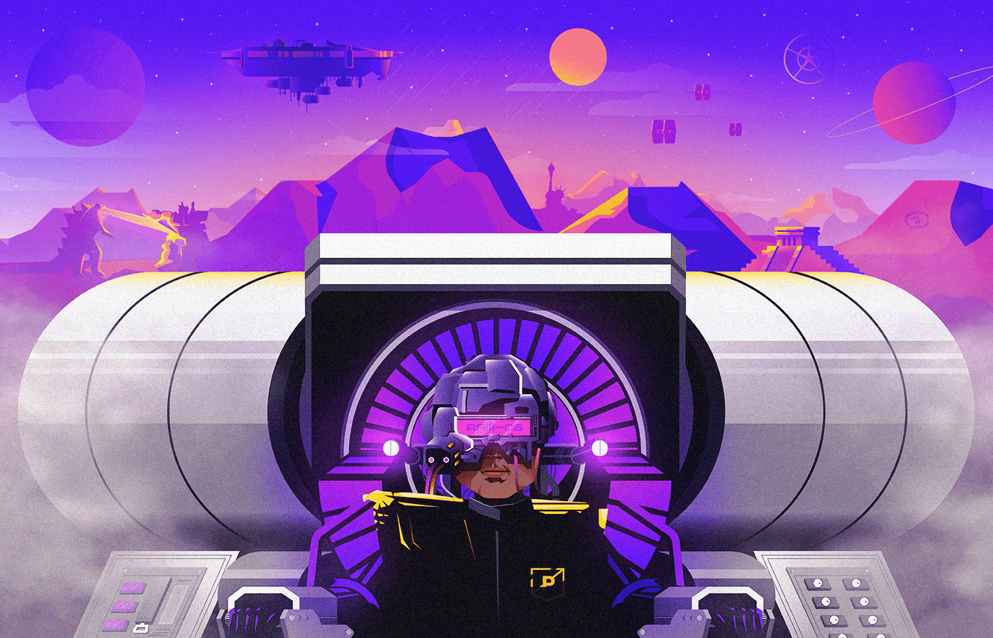
There’s a world out there. A totally made-up and fantastic galaxy of planets with men, beasts, and everything in between, where our roles are reflected by heroic characters. Our everyday work is their real-life mission. Through your illustrations for the PRPL brand and blog, I invite you to explore this world, and I can’t wait to see what you reveal.
That’s pretty much the pitch. The ambiguity is intentional. This approach lets our designers explore, collaborate, and build through artistic interpretation so that our readers and followers are given not only excellent content, but also an evolving world to explore through illustration. They can illustrate specific or vague concepts in new and exciting ways, and the work will be very PRPL.
Prompt into practice
To test the prompt’s effectiveness, myself and another designer teamed up to create the first series of illustrations, now featured on our website. Inspired by mid-century artists like Ib Antoni and Charley Harper, we developed illustrations that combine dramatic color with simple geometric style.
Following the prompt, we created characters to represent each of our services: Strategy, Content, Design, and Technology. In our story, strategists are agents keeping order on disparate planets, our developers are explorers building new worlds, our marketers are noble knights who arm themselves with words and concepts, and our designers are wizards with the power to craft the world around them.

Initial concept sketch on a whiteboard. 
Reference shots helped us get some foundational anatomy that we could later stylize. 
Rough sketch done in Procreate.

For the sake of consistency and helping designers with execution moving forward, we laid a couple of ground rules:
- All illustrations for the website and pitch decks will follow the mid-century style that inspired the first series.
- For our blog, events, and swag, our designers have carte blanche as long as they follow the prompt. If a designer decides that a content marketer is best represented by a Viking blowing the horn of truth on the back of a purple buffalo, so be it.
Onward
We believe there are certain places where branding restrictions are necessary and certain places where we should stay out of the way. At PRPL, illustration will always be a place where we’re going to light a small fire, step back, and see how it grows. I can’t wait to explore this new world together.
