Field Museum
Learn more about the museum website redesign we delivered for the Field Museum.

87%
increase in clicks out to ticketing platform from Visit-related pages on desktop
47%
decreased reliance on search to navigate from the homepage on desktop
360%
increase in clicks out to ticketing platform from Visit-related pages on mobile
153%
increase in average time on page
PROJECT SCOPE
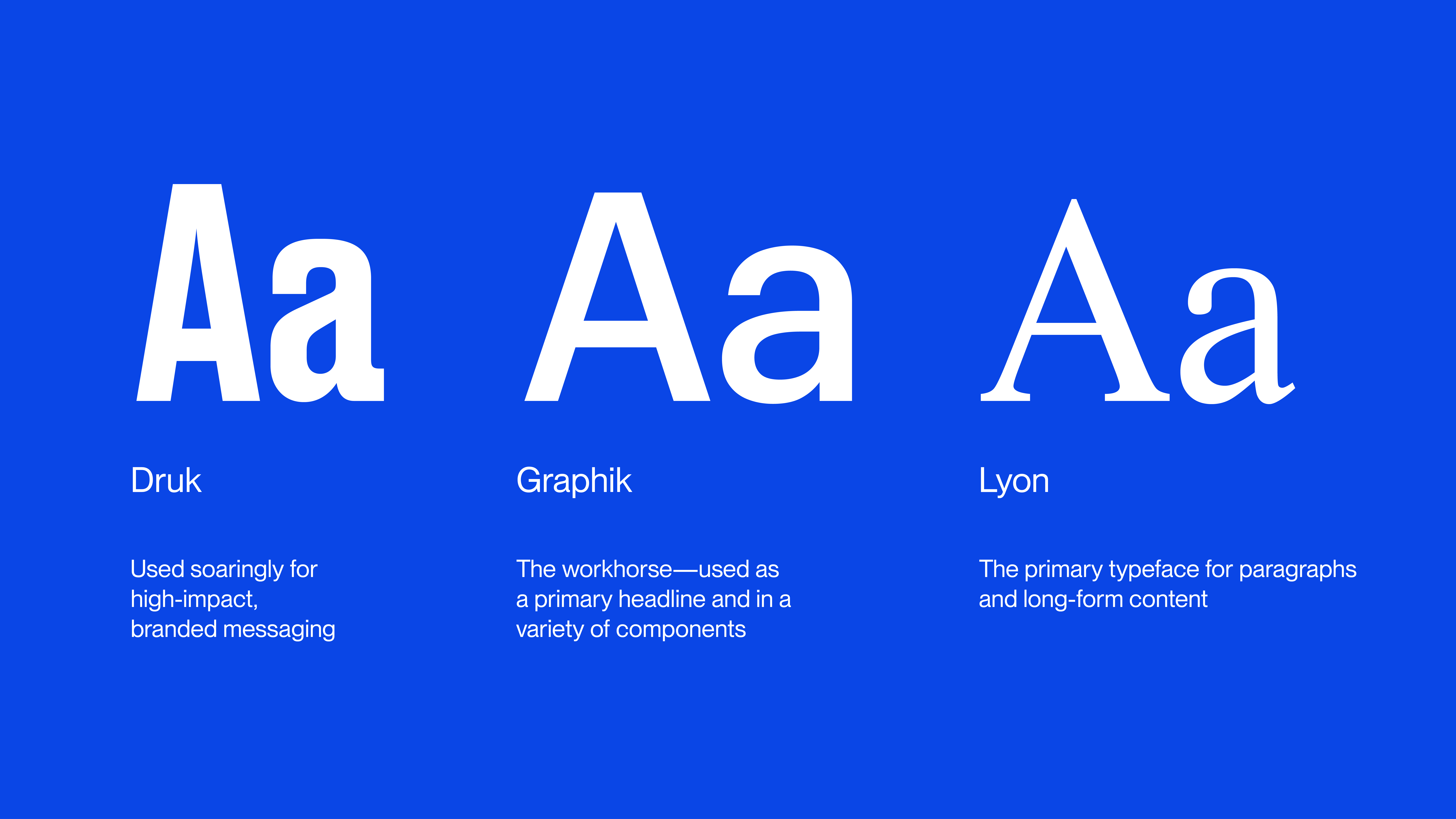
Fonts
PROJECT TEAM
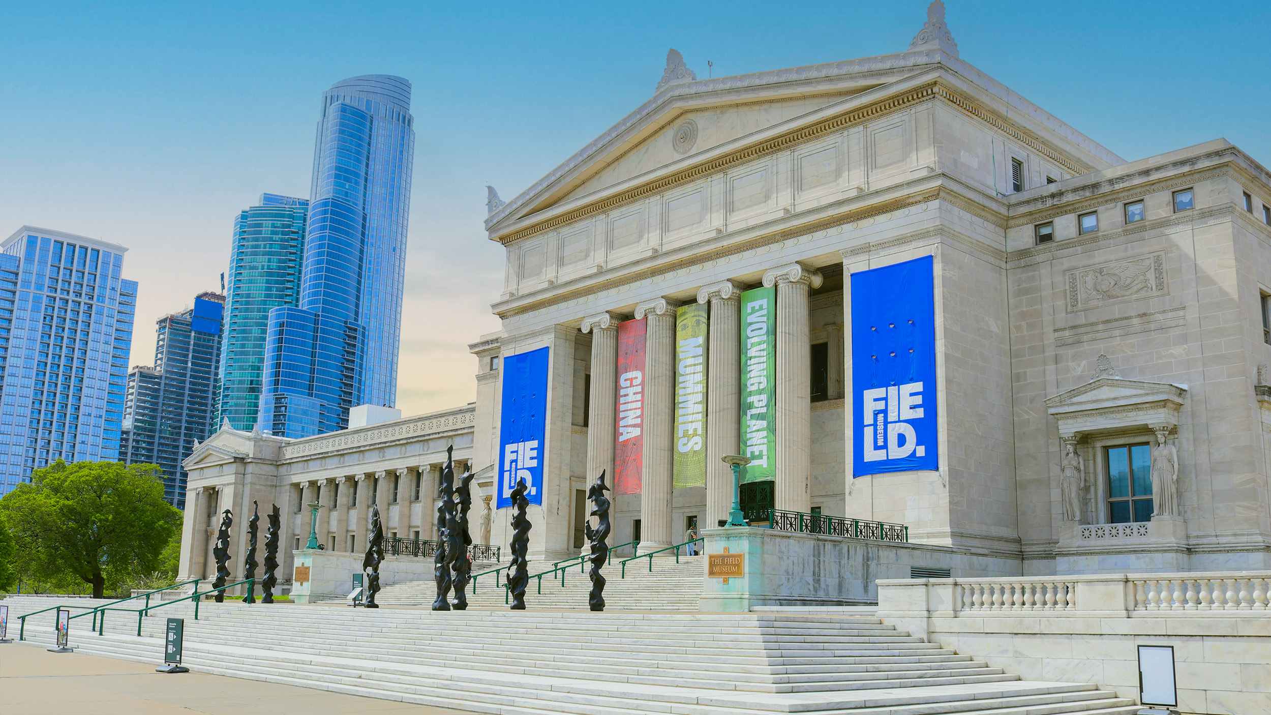
The Field Museum is a Chicago cultural institution and the fourth largest natural history museum in the world. On the eve of their 125th anniversary, they partnered with PRPL to redesign their website and bring their digital presence inline with their new brand and mission to “fuel a journey of discovery across time to enable solutions for a brighter future rich in nature and culture.”
Easier Exploration
PRPL overhauled the information architecture and navigation of the site, making it easier for guests to plan their visits. We determined and later validated our findings with motivation-driven personas, card sorting and user testing.
https://player.vimeo.com/progressive_redirect/playback/1099434405/rendition/1080p/file.mp4?loc=external&signature=a09cdcc283641b68a12e2c6e31057c17c95437624af1e6d68eaab5d027052756
Simplifying Access to Resources
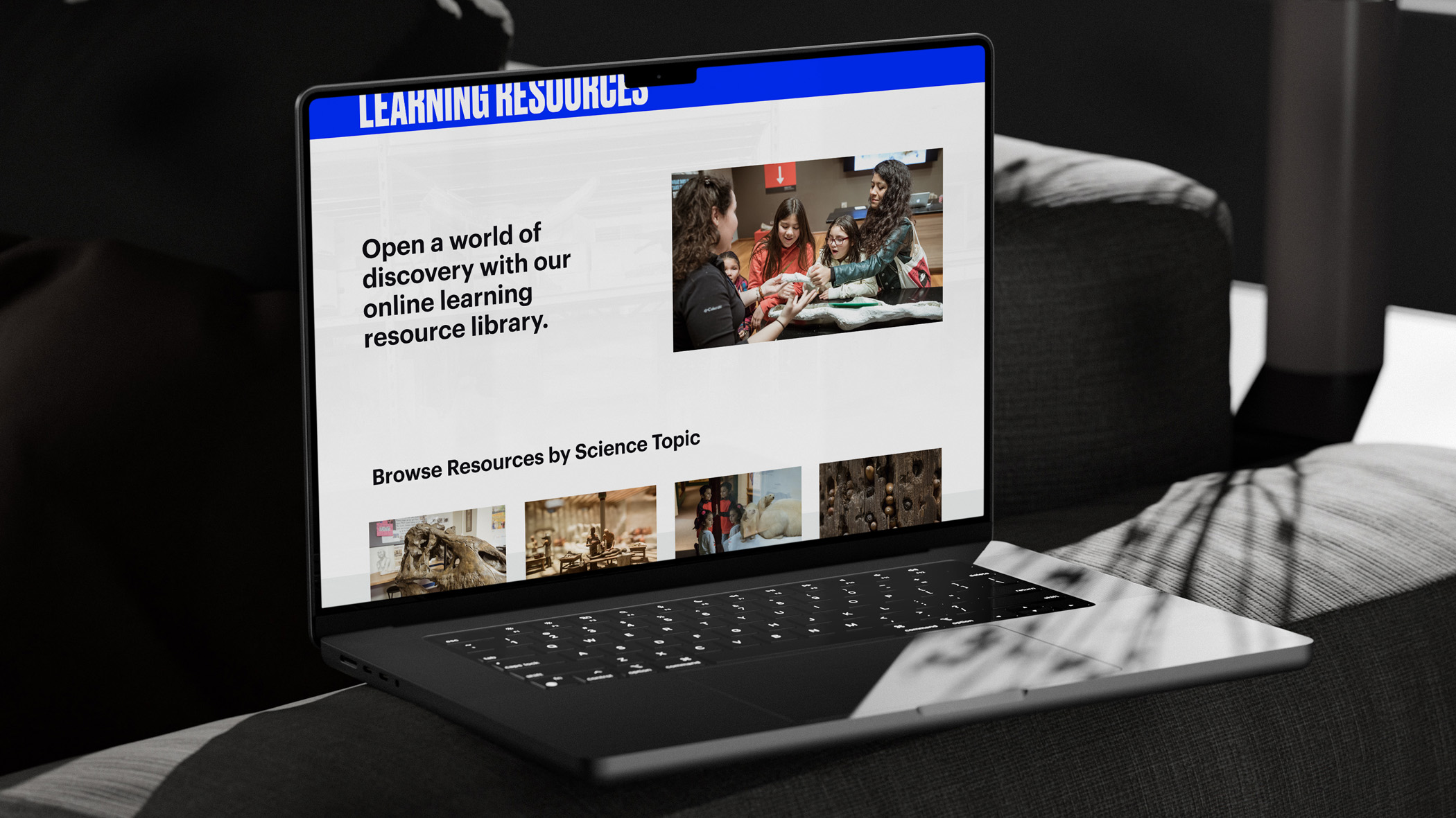
We completely re-thought user journeys for membership and, as illustrated here, learning resources. Our work centered on emphasizing topics that mattered to educators and using intelligent components to make resources findable and engaging.

Science for All
The Field Museum required WCAG 2.0 compliance from the start, giving us opportunities to innovate and serve users through design and development.
Contrast
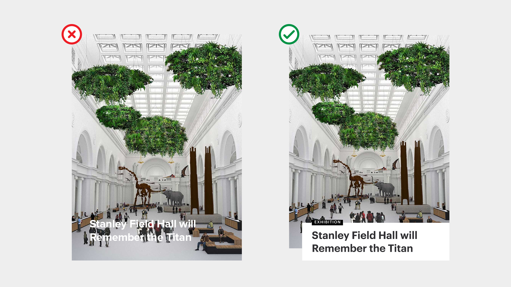
Accessible design patterns and minimum contrast compliance.
Markup
Semantic HTML that can be understood effectively through a screen reader.

Systems that Scale
We designed a flexible component system that can scale at the pace of content growth, and ensured that the foundation of data used to create the site will accommodate other applications in the future.
https://player.vimeo.com/progressive_redirect/playback/1099434468/rendition/1080p/file.mp4?loc=external&signature=7781a08fe910f28839c9672a5a427cbd2b69fe1f47aec6950c4234b9fde497ac
Bringing the Field to Life
Through clean, compelling visual design and thoughtful components, we brought the Field Museum’s new brand into the digital space for thousands to enjoy.
Translating The Brand
Working closely with Leo Burnett, PRPL faithfully translated the new brand into an engaging digital experience. During the course of design, we helped iterate on brand elements that fit the specific needs of the web.
Show, Don't Tell
We designed stunning image components including full-viewport galleries that immerse users in the unique stories behind the Field Museum’s exhibits and scientific missions.
https://player.vimeo.com/progressive_redirect/playback/1099434441/rendition/1080p/file.mp4?loc=external&signature=727111b7b4e12bec65a0a666ffdb6e313909f31f518b20c06535c5438f54c886
Typography, Color & Layout
The UI emphasizes the content of the museum while employing the brand’s type and color options to create a beautiful, scholarly aesthetic, establish hierarchy and add flashes of bold drama into the design.

Fueling Discovery
Interactive discovery components, taxonomy systems and a redefined architecture help users truly explore over 2,000 pages worth of science content. Explore a selection of components we designed below.
Science Shuffle
The Science Shuffle component appears throughout the site. It allows users to see related content, browse by the topics they are interested in - or roll the dice and discover something completely new.
https://player.vimeo.com/progressive_redirect/playback/1099434418/rendition/1080p/file.mp4?loc=external&signature=911b8f7b0638663aabeceadd6ef71872658532115afc204aa24d7bc76e365a61
Social Shuffle
Users can also explore through their own lens. Using an integration with CrowdRiff, we built a component that uses Instagram galleries of real Field Museum guests to generate calls to action that highlight points of interest on the site.
https://player.vimeo.com/progressive_redirect/playback/1086126760/rendition/720p/file.mp4?loc=external&signature=a9da7fc07e5adcc69fa4e95d40dd24ed2df43470430b448ef2bbfcad20e54d04


