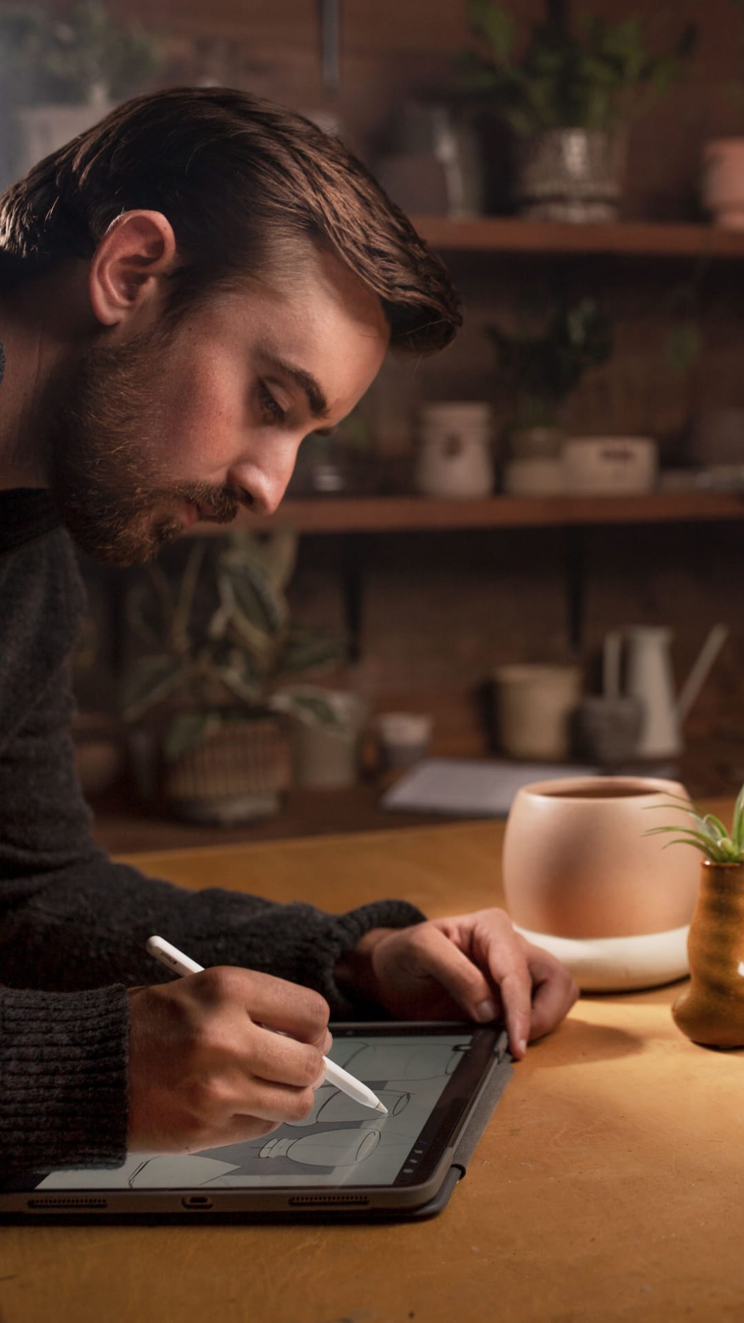
LiveTrends
Learn more about the e-commerce website redesign we delivered for LiveTrends and their family of brands.
Project Overview
LiveTrends Design Group is a lifestyle brand home to LiveTrends, Urban Jungle, and BeYou. Each sub-brand connects customers with unique and on-trend plant products for organic living-space curation. Now, LiveTrends expands its reach globally and trusted us with the design and development of their online shop and website.
Work
Site Structure
A big part of the project was merging four existing websites into one hub for all things LiveTrends. Not only does this streamline the user experience and make everything easy to find, but it also improves site maintenance. Now users can browse through LiveTrends, Urban Jungle, or BeYou exclusively or choose to shop all products within a single website. The e-commerce shop is integrated with WooCommerce, Authorize.Net, SAP, and Bizweaver.
Brand Buds
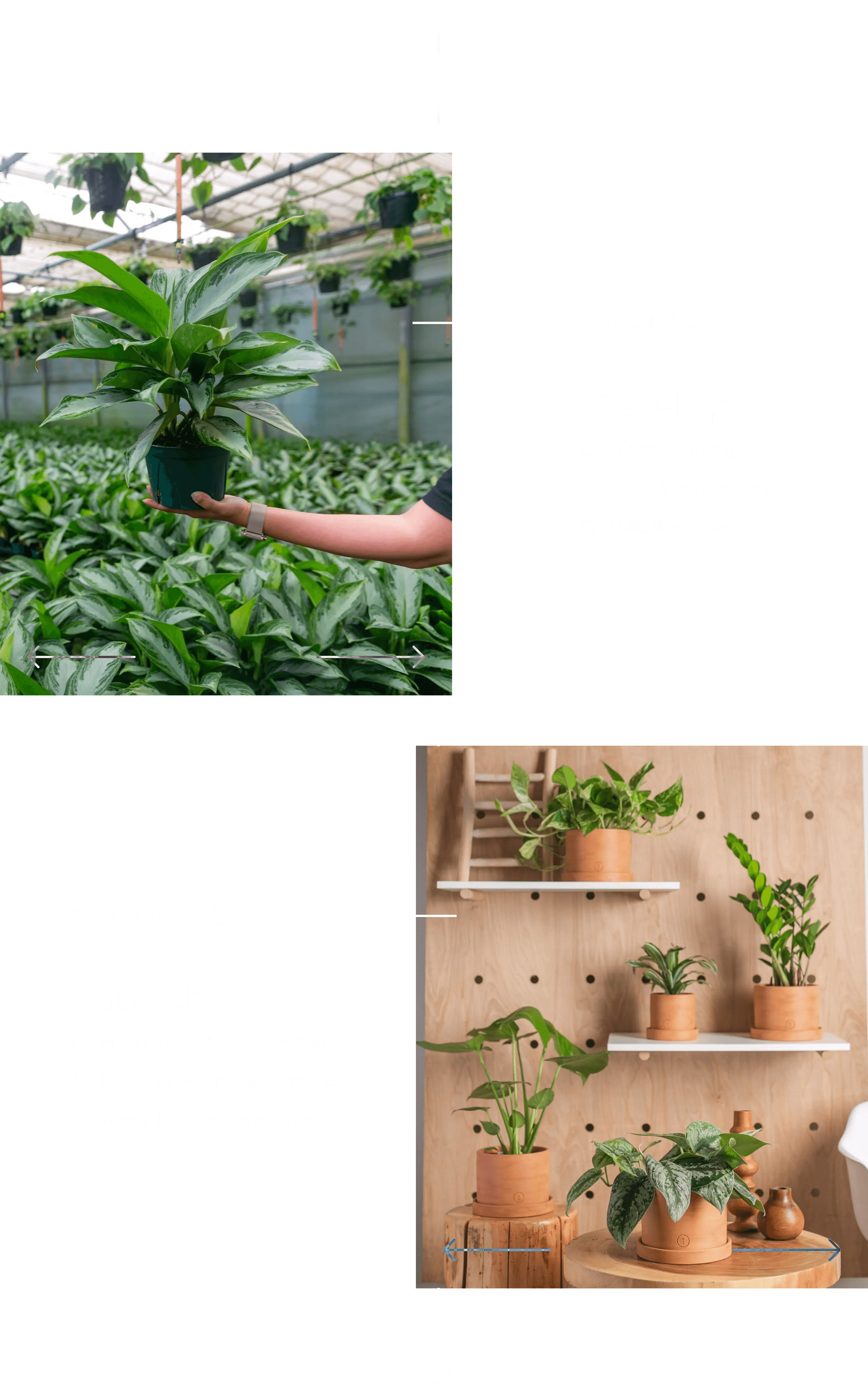
LiveTrends is the flagship brand. Products are available for a limited time only and are, naturally, on-trend. These plants are matched with their perfect pot by the always up-to-date LiveTrends designers—no mixing and matching. Urban Jungle focuses more on the plant itself. Choose the plant, then its pot. BeYou encourages customers to express themselves with its unique and delightful products.
B2B
Retailers can also take advantage of the new site flow for ordering product stock. We implemented a login wall for clients of LiveTrends to access need-to-know information. After logging in, clients can get all the insider intel on the latest trends and projections to better inform their orders. These pages break down where the trends come from, inform how they were created, and present case studies. Retailers see inspiration imagery along with the product catalog, similar to the B2C side.
B2C
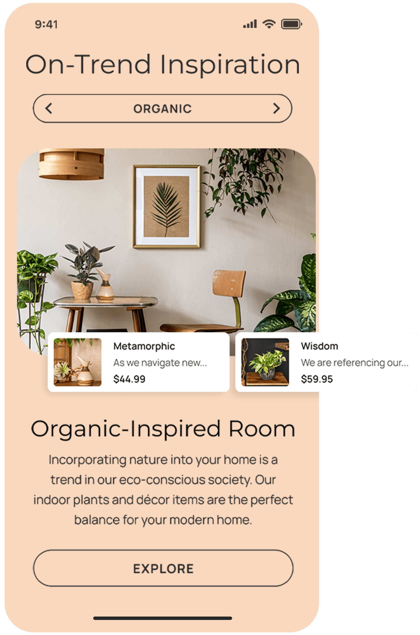
The new site is LiveTrends’s first step into the direct-to-consumer market. Their previous connection to consumers was through big-box retailers. Now, folks who want a new plant friend can go right to the LiveTrends site to search through and purchase products from each brand. Customers can also use the site to find inspiration for a certain style or current trend in home decor as well as access plant care tips and instructions for the new addition to their home.
Sort It Out
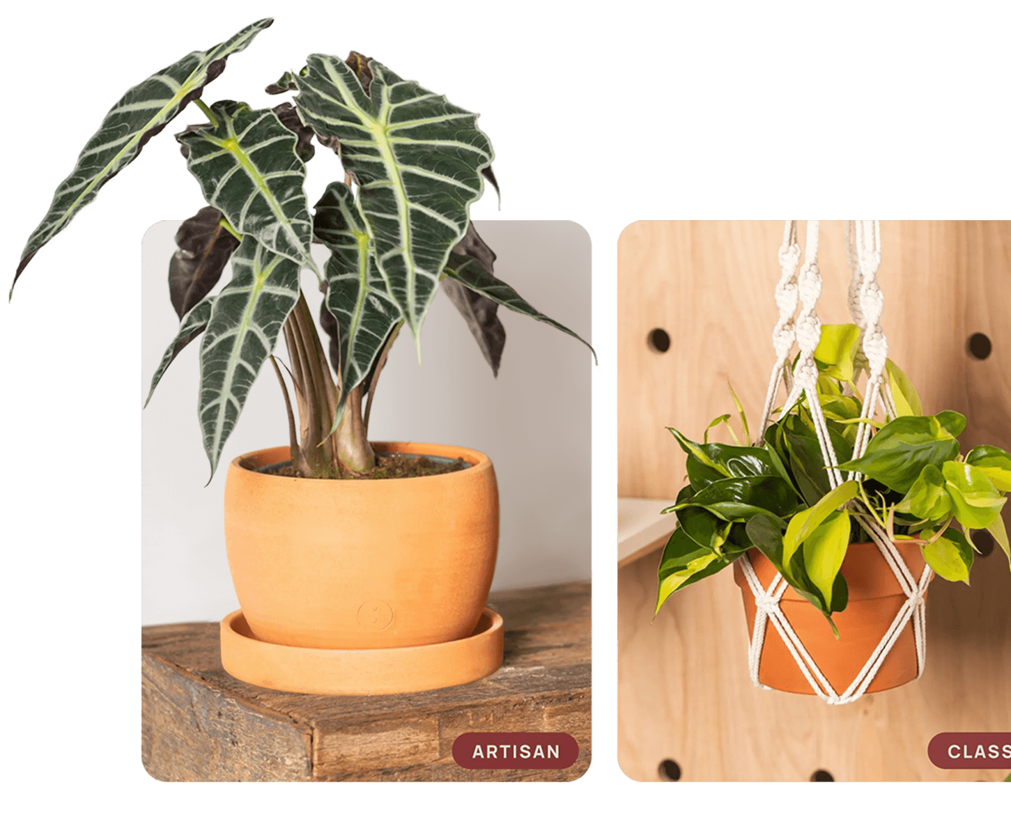
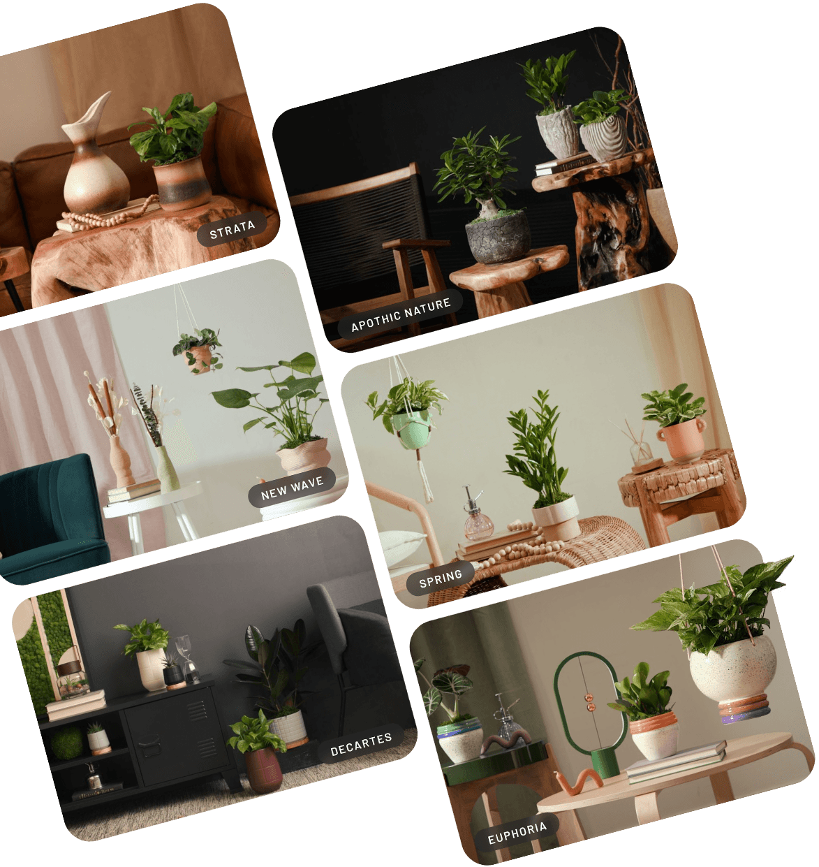
A curated tagging system allows content across the site to point users in the right direction to purchase products. The tagging system also lets users filter by different categories in addition to the respective brands. Tags include options for collections of styles, seasons, or trends—think “classic,” “spring,” or “euphoria.” Topic filters are also available—categories such as “new arrivals” or “air purifying.” Most of these tags will stay constant but the system is also dynamic in order to stay fresh and up-to-date.
Site Design
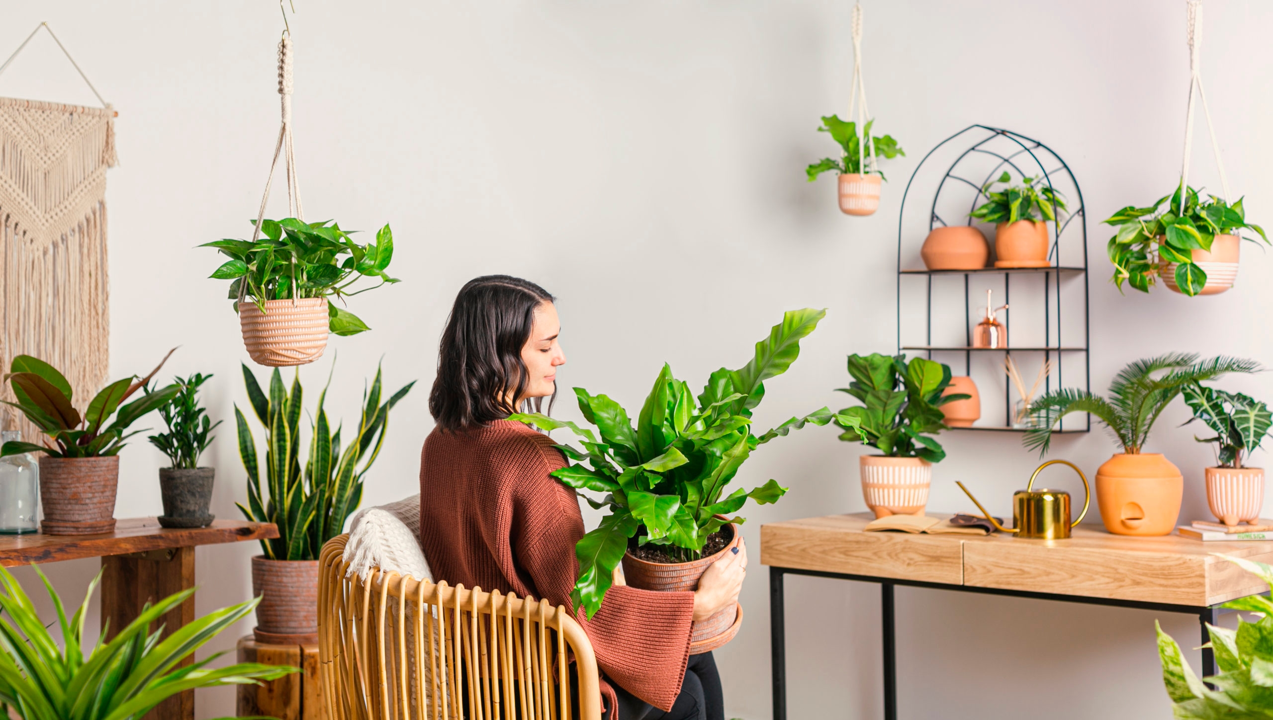
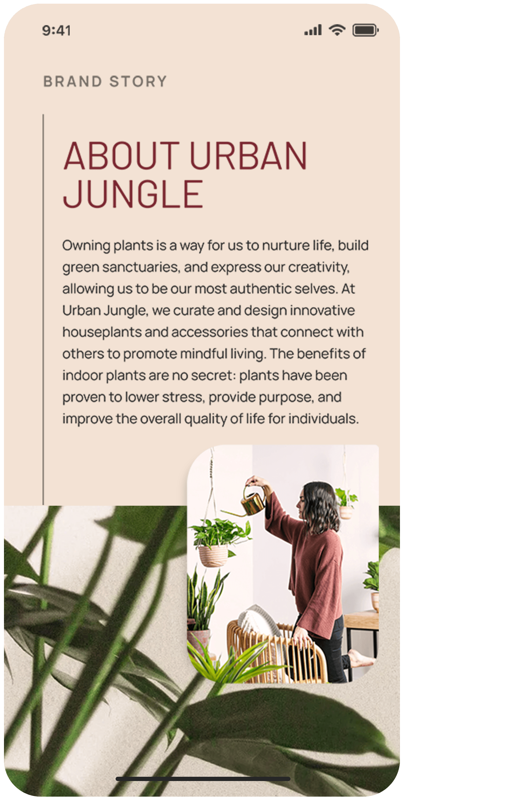
Being a design-focused company itself, we wanted to put the same attention, care, and standards into this site as LiveTrends commits to its business, products and clients. Our team’s attention to detail and commitment to the exploration and understanding of the LiveTrends brands put us in a position to bring artisanal solutions to the site design and functionality.
Blooming Into View
Throughout the site, users are greeted with animations that add interest and fluidity to every page. These activate when the page loads in and upon scrolling down through the content. They’re designed to guide site visitors’ eyes and bring attention to the hierarchy of the content.
Originality
We made sure to present LiveTrends with work that spoke to the company’s individuality rather than reference designs that already exist. Working in step with the design team and getting into a good cadence was essential. Sweeping curves is a design style that landed throughout the site. This motif brought elegance and beauty to the forefront. Setting each sub-brand apart was important, as they were designed to be viewed fluidly with each other. Each brand has its own font and style that fits in with the rest of the site.
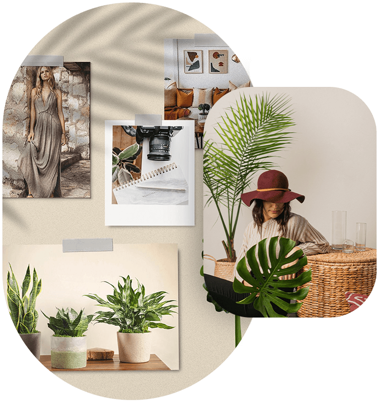
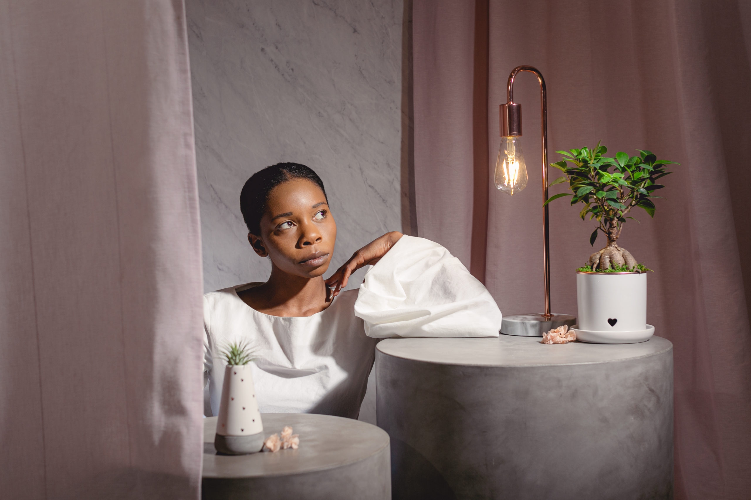

The site is extremely photo-driven. In addition to ensuring designs matched the picture quality and content, we chose to use offset formatting to bring attention to featured photos. We also used WebP images to take advantage of a small file size for the same vibrant picture quality. This made it easy to show off the colorful details on every part of the site—but especially the shop and inspo pages.
We use cookies to improve your browsing experience. You consent to our cookies policy if you continue to use this website.