Detroit Institute of Arts
Learn more about how we used a website redesign to help turn a notable collection into an immersive online experience.

49%
increase in time spent exploring DIA’s online art collection
58%
increase in traffic to DIA’s events and calendar
50%
increase in traffic to plan a visit to DIA
PROJECT SCOPE
Fonts
PROJECT TEAM
When one of the top six museums in the United States approached us to redesign their website, we were more than excited—and ready. The Detroit Institute of Arts Museum wanted to elevate its digital presence and bring their notable collection to life online while nodding to the community and better showcasing the inclusivity of its art.
A Sense of Space
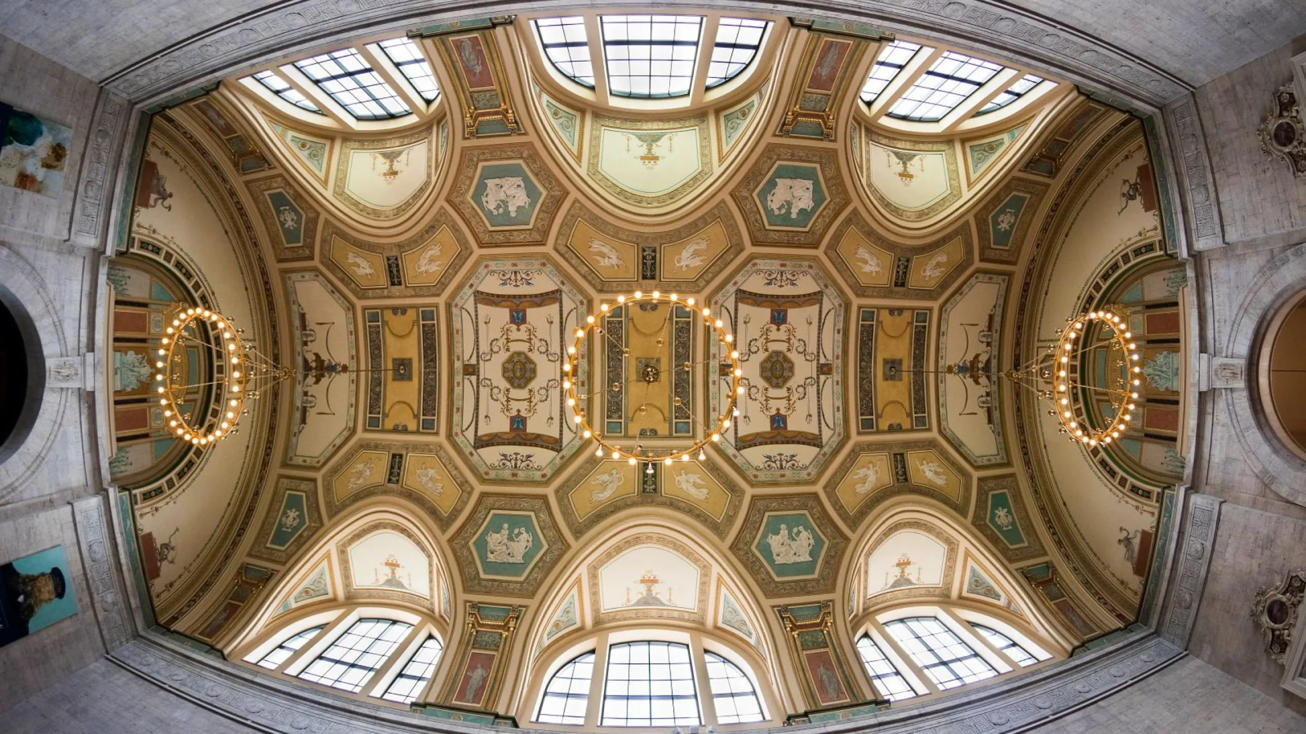
We used web design elements inspired by nuances of the museum itself to create a sense of space and connection that immerses visitors and causes them to pause and contemplate, before building anticipation. From the geometric patterns and page elements that echo the architecture of DIA and layout depth to the subtle motion that offers a true sense of the onsite experience, we drew in the look and feel of DIA in its physical sense to create a digital world of art unlike any other.
https://player.vimeo.com/progressive_redirect/playback/1062509207/rendition/720p/file.mp4?loc=external&signature=add384313a8763f4153594ff3e6ac36090fbc77d72e58582062faa01fe527b30
Clear Content Organization
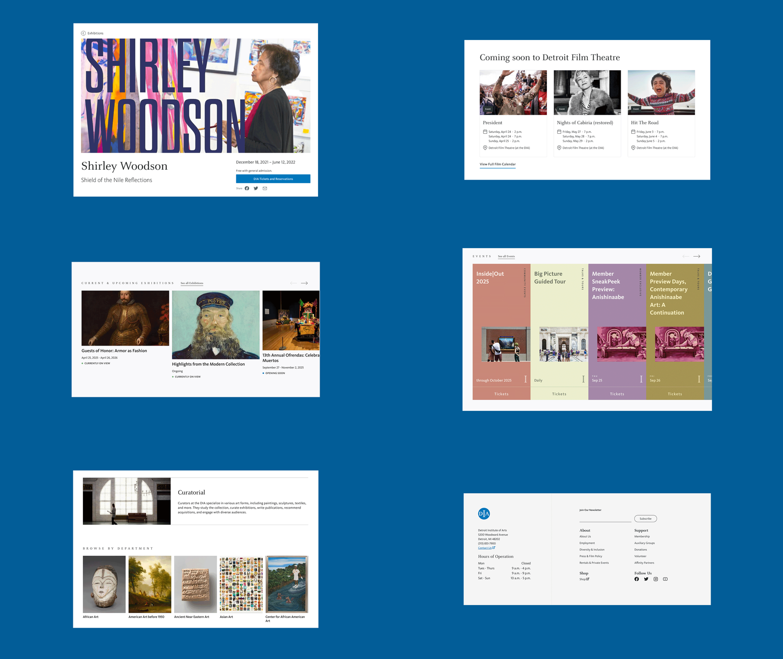
Among many of the project goals was the need to create a more flexible, manageable, and structured website experience—and we started with their events. DIA’s calendar function had initially pulled exhibitions and events together, so we restructured their calendar to separate the two and let users more easily navigate and choose what interests them. Then, we took sections of content around community and benefits of museum membership and prioritized them on the sitemap so users could enjoy a more informative and engaging website experience.
https://player.vimeo.com/progressive_redirect/playback/1121981456/rendition/1080p/file.mp4?loc=external&signature=fc9b84958310fd1c564457b6988b8f7a0b169dc60ce0fc0c407aba405470b146
https://player.vimeo.com/progressive_redirect/playback/1121983805/rendition/1080p/file.mp4?loc=external&signature=2c2f6f77ea6deb602c825730585db068c306f331f94792580a73e20d393e8b5c


A Fully Integrated Gallery
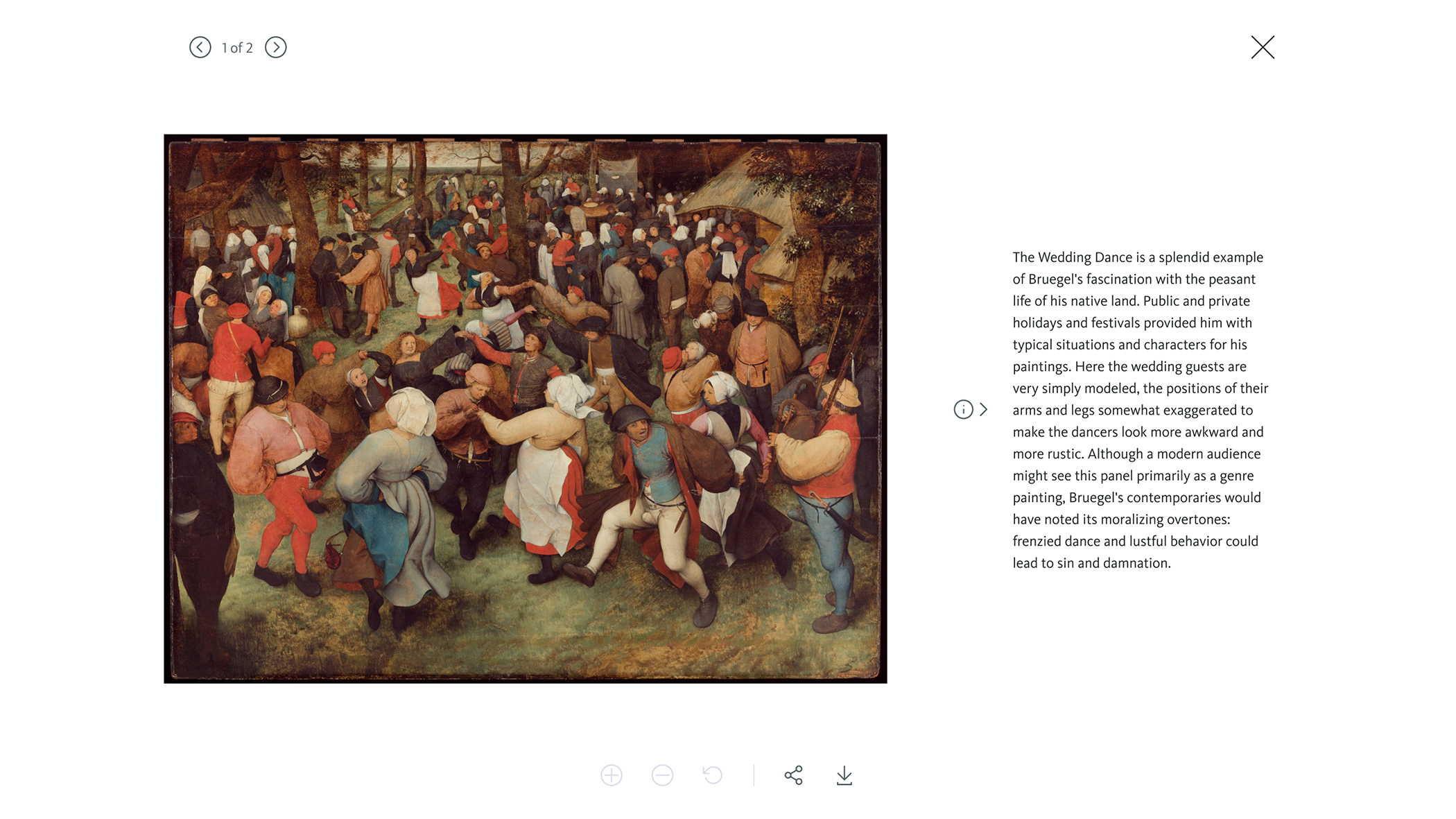
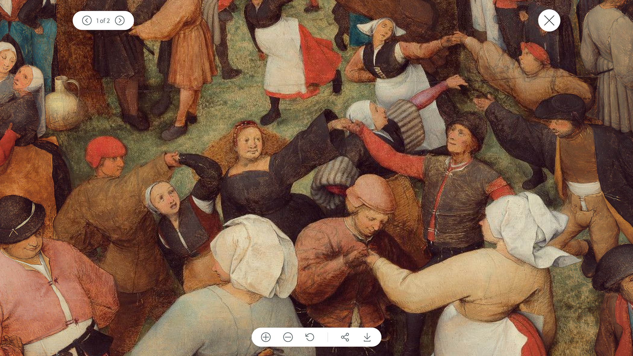
DIA came to us with over 60 thousand pieces of work being pulled from a specific API that included several different filters and taxonomies. Additionally, a lot of their collection photography offered an Inspector Tool that opened up to separate images highlighting different angles of the art. In order to offer a user experience that matches the streamlined and virtually seamless experience in the museum, we built a robust search function that could handle—and feature—a collection this large and enabled a database that can be easily managed by the DIA team.
https://player.vimeo.com/progressive_redirect/playback/1121984944/rendition/1080p/file.mp4?loc=external&signature=5b46c4e22077f8dab033f474e7b0ff862cdc5d332cb2d5b4a19b45a89fd864bf


A New DIA
After months of continued collaboration and hard work, the new DIA site went live. And we not only increased website traffic that turned into foot traffic, we elevated their brand while helping them bring their diverse collection of art and artists into the community spotlight—and there to stay.


